2. Know the Target Audience
The banner design must contain two things for it to work effectively that is: It should know the preferences of its audience and then curate the kind of information, insert that into the banner and convey their message according to the aforementioned factors through this medium. You cannot, again and again, advertise the taste of sweets in front of a person who is diabetic. For selling it successfully, you should market it to different appropriate age groups. Similarly, you should know your audience before advertising the product.
If you want to sell your product to our big businesses or brands, you should try inserting more sophisticated colours and fonts which would reflect a stroke of professionalism. If you want to target children, you can include colourful images, cartoons, toys which would entice children and create ' want '. If you want to target teenagers, you can include some pop culture references, shades of emotions and things like that. This is the only way how banners can target large audiences and encourage them into buying the product.
3. Use of Colors :
One cannot underestimate the role of colors in banners or just about any part of advertising. There is a reason why people like Unicorn cakes as it has a full flood of colors. There is a reason why people like the spring season as it brings out every single color of nature. And still how they spur emotions and reactions. To make use of colors correctly, you can start with small groups of colors at first, experiment with them and then start discovering more and more. By seeing a lot of colors at the same time, it is obvious that the mind will get confused and you won't be able to decide correctly. Also, keep in mind to use neutral colors like black, white and grey because they provide balance in many ways.
Different feelings is attached to different colors, Here are some:
- Red: Passion, anger, excitement, and love
- Orange: Playfulness and invigorating feelings
- Yellow: Cheer, sunshine, and friendliness.
- Green: Health, freshness, wealth, the environment, growth, nurturing
- Blue: Safety, trust, clarity, maturity, serenity, intellect, formality.
- Purple: Luxury, royalty, extravagance, wisdom, magic.
4. Strong Heading
Remember how for English exams in schools, you were required to write an article with a really good heading? Because a good heading supported good marks? Well, making banners is pretty much the same. Having a captivating, simple and sharp heading really attracts people to read all the information provided underneath. It does its job of persuading others. It creates enticement and the immediate need which is where many people lack. By using variations of font designs, sizes and colors, you can do a good job. Write a winning headline for your product that invokes thought and curiosity.
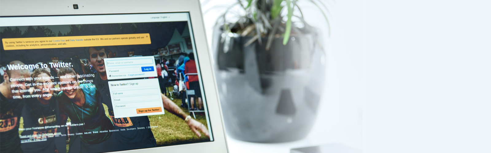
5. Placement of ads
Designing a banner is a job half done, its placement also carries weight in it influencing a consumer who is operating your site. It must not overlap the main content or in any way hinder or drive away from the person from going through the basics of the site. You should have enough space on the website so that it does not in any way look cramped.
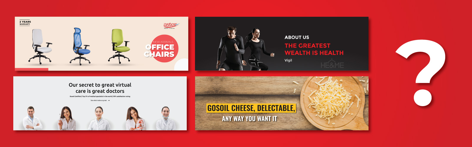
6. Choosing Images
Use the kind of images which is relatable to the banner, which speaks along with the information, which compliments it more. Many times an artist has his own view and idea in mind which might look good to him but is not able to convey the message thoroughly. You must ask others how it looks and positively takes their feedback since sometimes a thing will look or sound good in one mind but when it is thrown in the open, others might not find it relatable.
Images also provide consumers with a visual look of how the product looks like. It provides a little sneak peek into the product which actually induces curiosity.
7. White Space ( Good or Bad )
During examinations, if you leave huge blank spaces it clearly reflects that the student does not possess enough knowledge to fill it and is unprepared. All these little things leave an impression. Similarly, when you leave blank spaces in your web it without a doubt leaves a negative impression on the viewer. It makes them judge the competency of the owners. There must be a balance between both aspects. It must not be crowded or empty. Both are red signs when it comes to making a successful website or app.
And obviously, white space does not mean it has to be white in color. If you leave a space blank, it is classified under white space.
8. Maintaining Hierarchy
The purpose of a banner is what? To create more and more brand awareness and increase the popularity of the product.
They have 3 main basic components that are: value proportion, call to actions and the company logo.
Company Logo: Finding a balance between company logo being visually dominant but not as dominant as the value of the proposition and the product itself is the key to a good logo.
Value Proposition: It itself attracts a lot of attention to customers. That specific attention is immediate in nature. Like, 50% OFF, 75% OFF or Organic Products or High Quality, such flashy propositions catches the eye of the customer.
Call to action: It is an open invitation for the users to click. The call to actions or ( CTA ) becomes the focal point of the ad persuading to the customer to dig deeper into the information being provided.
There is a method to be followed or several styles to be tried out before setting the hierarchy of different ads to be put into the website. The promotions when placed in the right places would draw customers and increase popularity. This is how the hierarchy of banners affects the influx of traffic.
9. Simple is more, Less is more
Imagine reading a banner which is filled with information on all corners, even the middle, designs, images, blown up with different colors. Can you? This is what people call a complicated banner which just confused the brain and draws the person away.
You need a banner which speaks to the point, sends a clear message like Joe Pesci, is filled with the color which compliments one another, has the kind of images which visually gives the idea of the product but does not reveal anything as such, plays with sophisticated designs and just gives you a full-blown experience.
It must blend all the factors. Give something different and unique. Like people love chocolate, people love peanut butter too. But someone created their fusion and it was something new, which became popular.
These facts are true to any situation and can work in banner designs too. A well thought out fusion never goes wrong.
Another well-known fact is Simplicity is the key to sophistication. Keep your banner simple. It engages and interacts more. It is way more impactful and It sends a clear message.
10. Limit to One offer
There are many sites that you might use daily which throws too many offers that do nothing but confuses people. And later you find out that you don't meet the requirements of any single one of them. That is a disappointing way to empty your shopping cart. Before listing any kind of offers and a list of promotions, try keeping it concise and just ' easy ' for the consumer to understand. This is way more attractive as it is simpler and an easier option. Any person would go to Flat 50% sales rather than companies offering 50% off on products only after having shopped a specific amount.
11. Using Animations and Motions
Static Ads are a thing of past now. Using new technology make consumers see new kinds of variations in ads every time which might drive them to click it or know about it more. Animated and moving advertisements outperform static banners and also is usually pleasing. By not taking too much time and throwing the most relevant information about the product is what makes an ad or product successful. By using animations you can simply do that easily.
12. Use of Fonts
We all probably remember the time when in our computer classes our teachers introduced us to Microsoft Office and we would take more than 15 minutes to just the font for the title because there are so many options. Explore all kinds of fonts available, choose the right one which looks appropriate and catchy and exploit it to your advantage. But do not use cursive fonts, thin fonts or sizes which are smaller than size 10 which is probably considered what of the 'do not '. Use attractive fonts and write your message in beautiful handwriting.
SPIDER INDIA,Chennai India. offers you exactly the kind of banner designs which you companies need. Our team is has all the shades. It is imaginative, unique, creative and all these factors ' show ' clearly in the kind of products that are designed by us. We let your ideas speak through our skills. It is a fusion that you certainly will not regret. Digital Marketing is an important part of our day to day life as well as of your company. We start from the scratch and build our ideas through, step by step. It helps us define neat features and make a quality product which would make you and your customers happy. It will guaranteed give a boost to your internet traffic as well as popularity. What more do you need ? We will give it to you in a silver platter.